Same institute – new look!
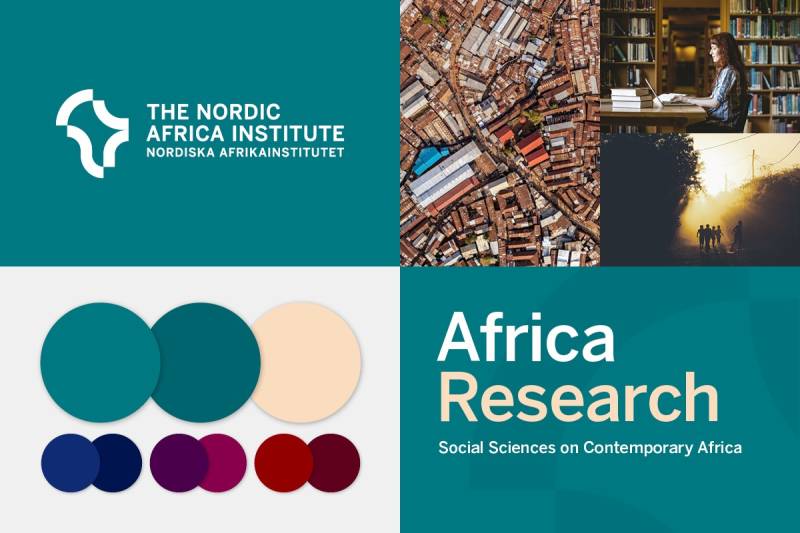
The Nordic Africa Institute is introducing a new graphic profile. The new logo – featuring the African continent visualised as semi-circle shapes – reflects the image of a modern, diverse and ever-changing Africa, says NAI Director Iina Soiri.
“It is very satisfying that we have a visual concept that matches NAI’s identity, values and role within contemporary research and knowledge production”, Soiri says.
A visual identity has many components – logo, colours, typography, graphic elements and image style – which together communicate an organisation’s personality and core values. While the institute’s previous visual identity, in use since 2008, was based on a dark green colour and included artwork borrowed mainly from traditional African art, the new graphic profile aims to be both timeless and forward-looking.
“It fits well with how we see ourselves and how we view the ever-changing, diverse African continent. During the design process, we noted with satisfaction that the people of NAI have a common idea of what the institute’s identity is and what our strengths are. This has now received its visual form, Soiri says.
The new graphic profile provides a common visual concept for all the Institute’s events and activities, explains Victoria Engstrand-Neacsu, Head of Communications at NAI.
“We needed a more comprehensive profile, one that includes all our channels, old and new, physical as well as virtual. This new profile will be the richest the institute has had in its 57 years. My hope is that it will help to make our work even more visible among our target groups. ”, says Engstrand-Neacsu.
The new visual profile was created by design agency Edelström Design after a thorough development process including all staff members.
When creating the new logotype, Niklas Edelström, CEO of Edelström Design, started looking at the shape of the African continent from an artistic perspective.
“Africa's contour has been used by the Institute since it was founded in the 1960s. The strategy was to build on this heritage, but to develop the shape. The institute had to make its own interpretation, since Africa's shape is used by many other companies and organisations,” Edelström explains.
He then explored if a graphically clean visual element could make up the contour line and came up with the idea of using semi-circles.
“Now the Institute has its own design language, not just a straight Africa map contour,” Edelström says.
TEXT: Mattias Sköld